


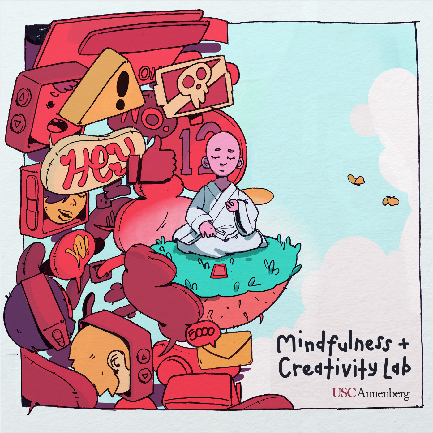
Knowing a little bit about what makes good design is helpful no matter what field of work you’re in. To understand good design, you must understand the rules and principles that guide it. Good design is invisible. You hardly notice when something is designed well, but it will be painfully apparent when there is bad design. It is key to understand the elements of design and how to best utilize them. This tutorial covers the basics – elements of design, color, typography, and general rules of thumb.
Elements of Design
We will cover 5 elements of design – Lines, Shapes, Texture, Color, and Typography.
Lines
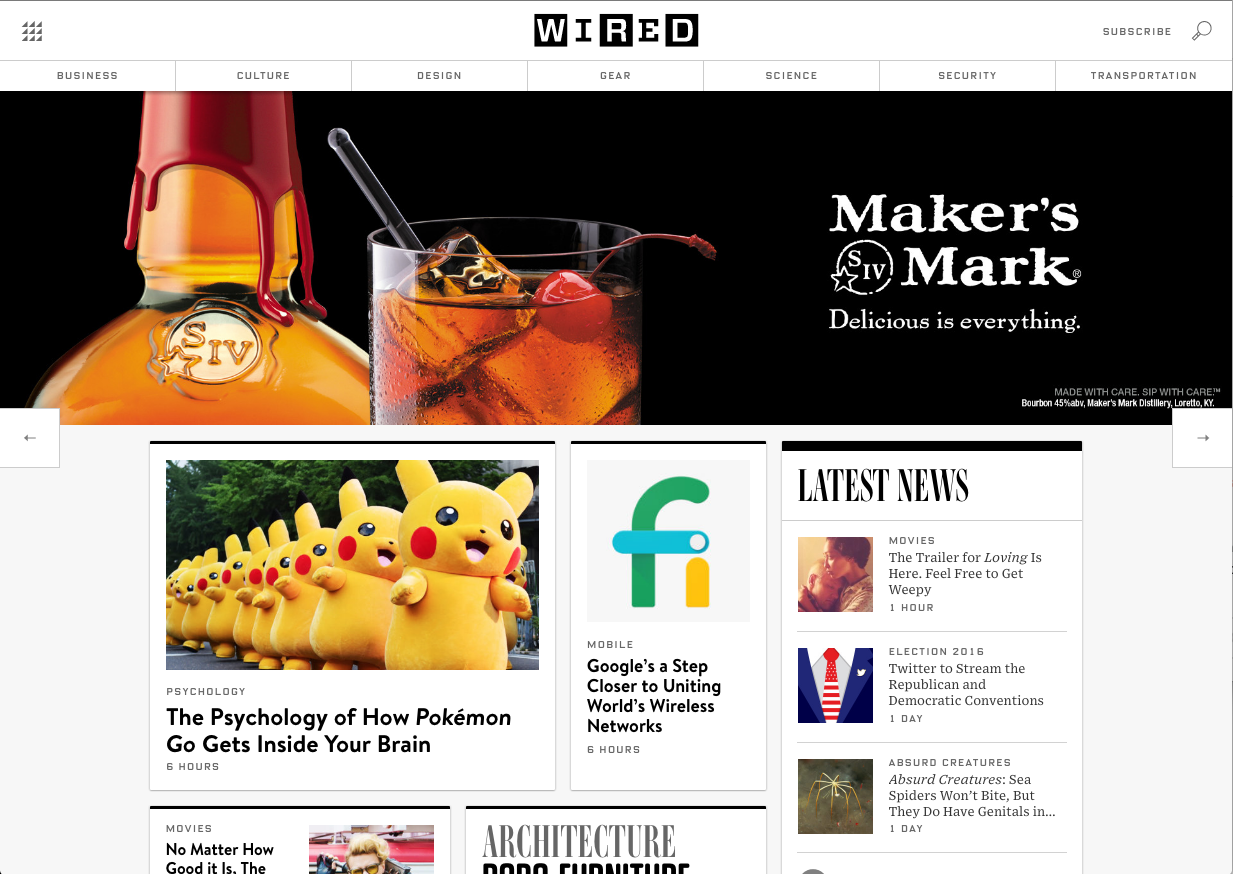
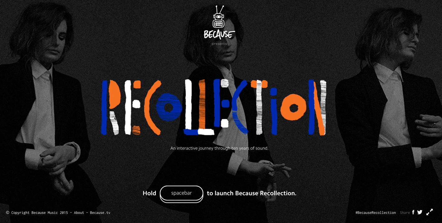
Lines might seem like a simplistic element, but they’re crucial for organizing visual information, and setting the tone for a design. Horizontal and vertical lines often evoke stability and structure. On the other hand, diagonal lines are more dynamic and create a sense of motion. Take a look at the Wired website versus this agency’s website infographic.
Shapes
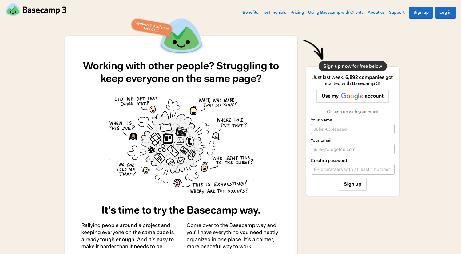
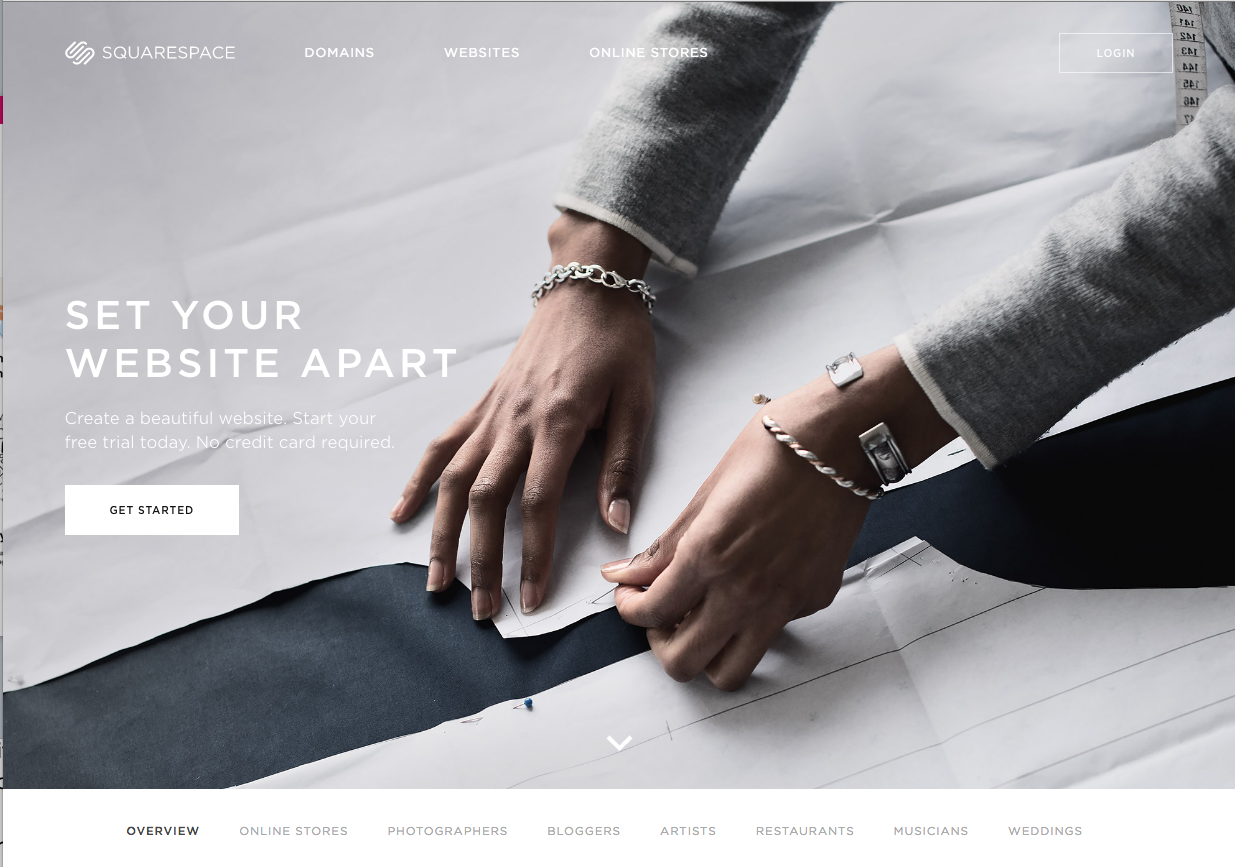
Shapes might also seem like a simple concept – but think about the tone and feel of different shapes. In the example below, notice how the Basecamp website uses more fluid, rounded, and circular shapes, which evokes warmth and playfulness. On the other hand, the Squarespace website uses lots of rectangles and straight edges that keeps a clean and professional look.
Texture
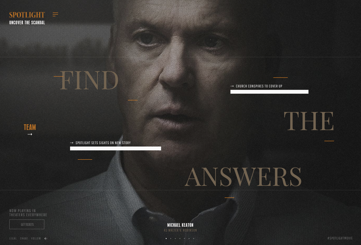
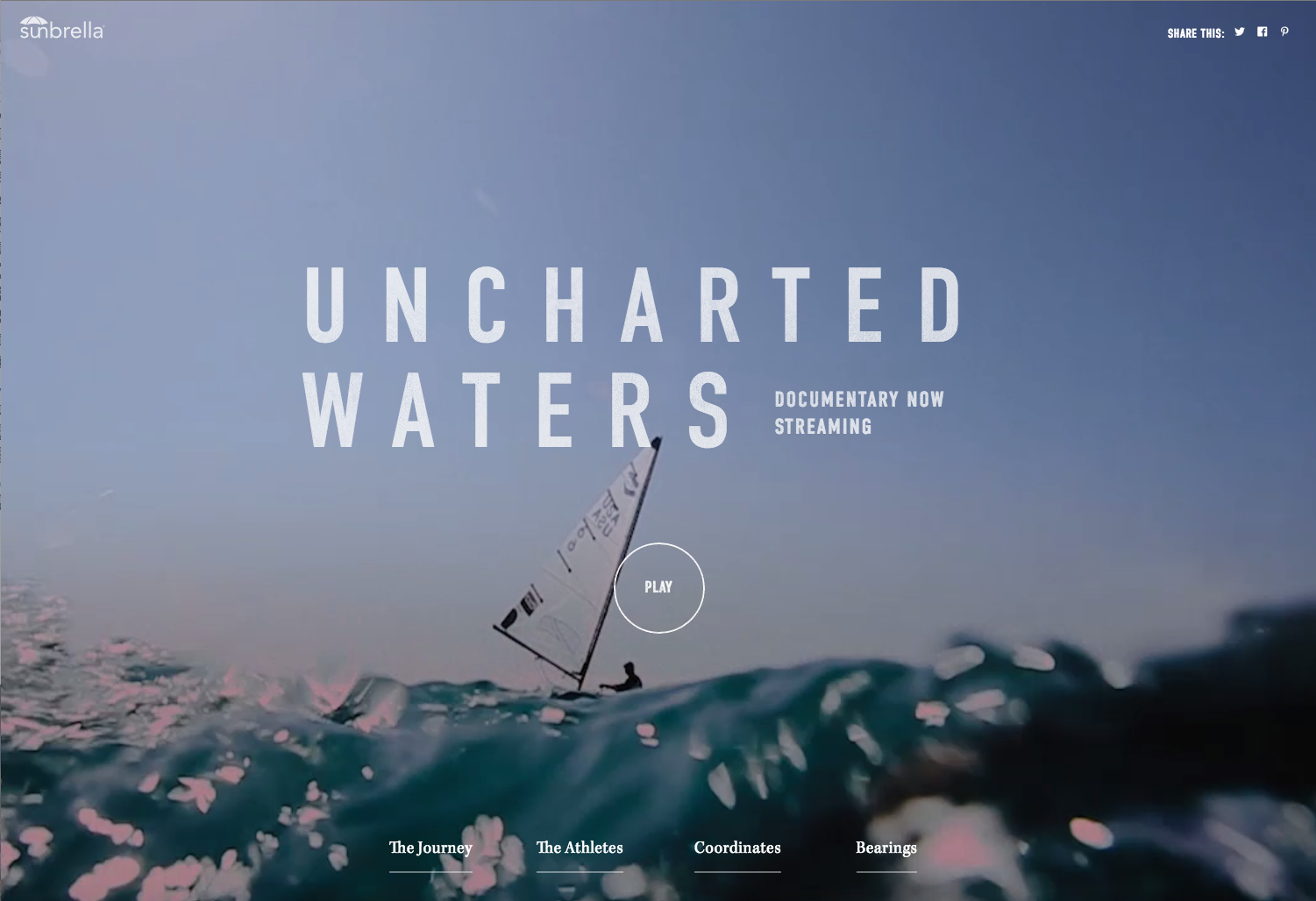
Texture creates depth and can add another layer of meaning to a design. In the Sunbrella website uses the splash of water as a texture, which almost makes it feel like you can touch the water or that you’re there on the boat. The Spotlight website adds a grainy texture to give it an old newspaper or film look.
Color
Color is very important, especially when it comes to branding and marketing. Just like lines and shapes, color evoke tone and feelings. Think about how warm colors, cool colors, or neutral colors make you feel. In the following section, we will cover Color more in-depth.
Typography
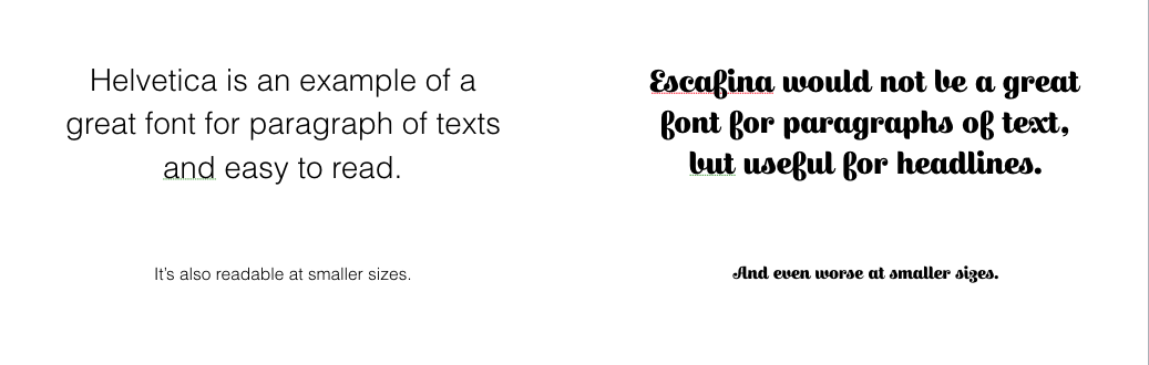
Typography is the art and technique of arranging type to make written language legible, readable, and appealing when displayed. A “typeface” is a family of fonts. For instance, the Helvetica typeface includes several different fonts within it including Helvetica Regular, Helvetica Light, Helvetica Bold, etc.
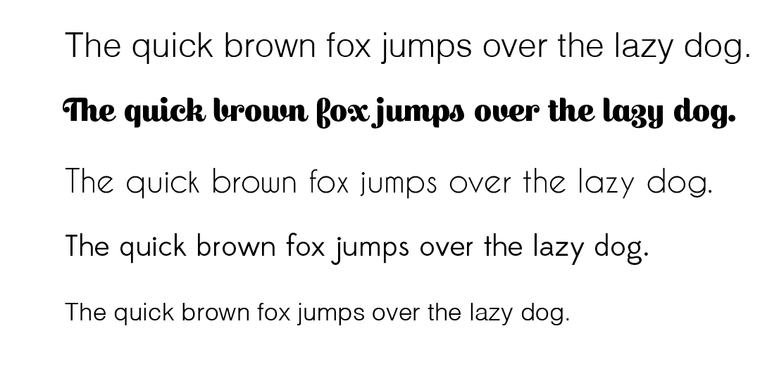
Often times, you will see fonts in the following below (The quick brown fox jumps over the lazy dog). This phrase is used because it includes every letter in the alphabet! The font you choose also helps define the tone and feel of the design. Notice how different the sentence feels and looks in each font.
Color
In the next two sections, we are going delve into 2 elements in more depth – Color and Typography. In color, it’s important to understand the difference between RGB and CMYK and the concept of the color wheel.
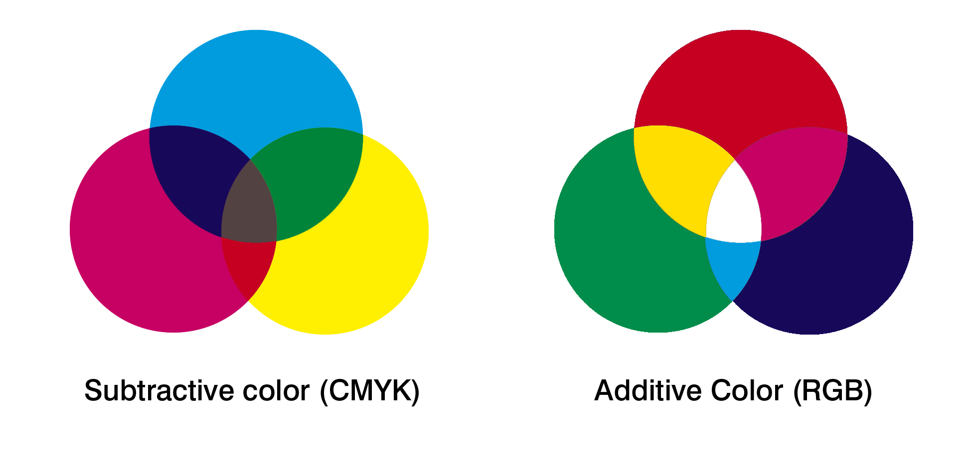
RGB vs. CMYK
RGB stands for Red, Green and Blue. The RGB colors are additive colors, which means they can be combined to make every other color. We typically see RGB color mode used on the web.
CMYK stands for Cyan, Magenta, Yellow, and Key (a.k.a. Black). Instead of additive, CMYK colors are subtractive. The more colors you add together, the darker the colors. Typically, CMYK color mode is used for print and most printing companies print in CMYK.
When creating a design in an Adobe program, you can select the color mode. Therefore, it’s important to take into consideration what medium you’re designing for when you start your design.
Color Wheel
As you learned in elementary school, you’ve got 3 primary colors – Red, Yellow, and Blue. They all can be combined to make the other colors in the wheel – red and blue makes purple, red and yellow makes orange, etc. It’s also good to know relationships within the color wheel.
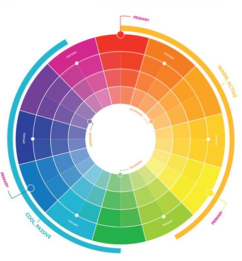
Warm Colors vs. Cool Colors: We’ve got our red / oranges / yellows that make up our warm and active colors and on the other side, you have purple, blue, and green that make up our cool and passive colors.
Monochromatic: Monochromatic colors are shade or tint variations of the same hue. Each triangle piece of the color wheel is a monochromatic color relationship.
Triad: A triad relationship are three hues that are equally positioned opposite of each other such as red, blue and yellow.
Complementary: These are two colors located opposite each other such as red and green, purple and yellow, or blue and orange.
Analogous: These are colors that are located adjacent to each other such as red / orange or green/blue.
You can use different color relationships to create something that goes well together or you can use opposite colors to create more contrast. Knowing these color relationships can help you make more intentional decisions with the colors you choose.
Online Color Tools
There are lots of tools online to help you make color palettes! Two websites that we recommend are Adobe Color and Coloors. Both tools allow you to create custom color palettes and lock in a single color that you’re trying to make a palette with. Adobe Color allows you to create palettes based on some of the color rules/relationships we discussed above and you can even save it into your Creative Cloud library.
Typography
When it comes to choosing and setting a font, it’s important
Sans Serif vs. Serif
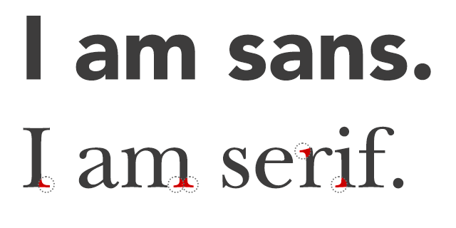
Fonts can be categorized into San Serif vs. Serif. Serif fonts have flourishes or “little feet” at the edges of the letters, while Sans-serif fonts do not. People associate serif with printed word, and thus with a bit more trust. Sans-serif fonts are usually described as more modern.
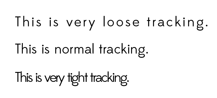
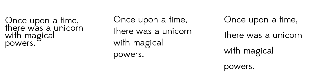
Tracking
Tracking is the letter spacing between a group of letters in a sentence of paragraph. As you can tell from the examples below, tracking affects the density of the copy and its readability.
Loose tracking might be good for a headline that you want to give more emphasis to, but too loose tracking will cause problems with readability.
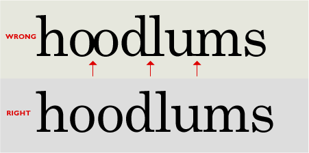
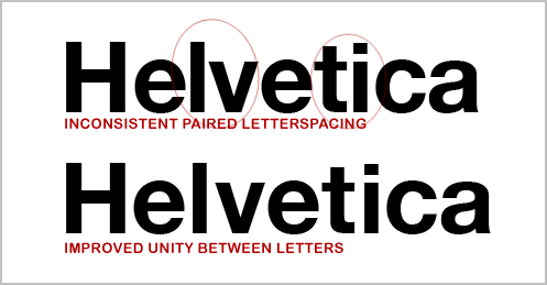
Kerning
Kerning is the horizontal spacing between 2 characters.
Leading
The vertical spacing between lines of text.
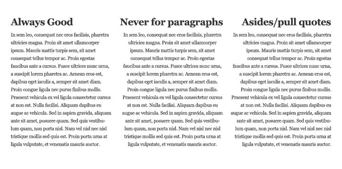
Alignment
We mostly use left alignment especially in books and on websites. since we read left to right, it’s the most natural and easiest way to read text. Centering text should never be done for paragraphs of text – but can be used for situations like headlines.
Type Website
There are tons of websites to buy fonts. Websites like Lost Type, DaFont, and 1001fonts lets you use fonts for personal use for free.
Design Principles
Hierarchy
Definition: An arrangement or classification of things according to relative importance
In design, hierarchy helps visually show what’s the most important and what the viewer should look at first, second, third, and so on. You’ll notice when you look at something designed well, it’s easy to tell what the graphic is trying to convey and your eye should immediately jump to an element.
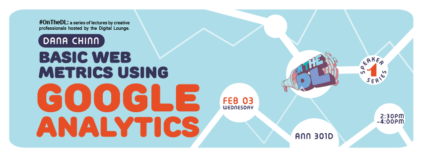
Example:
Take a look at the hierarchy of elements in this graphic. Your eye immediately goes to the headline and “Google Anlytics” and then the dates and times.
Contrast
Definition: The state of being strikingly different from something else, typically something in juxtaposition or close association.
Contrast can take place in many forms in color, texture, size, and value.
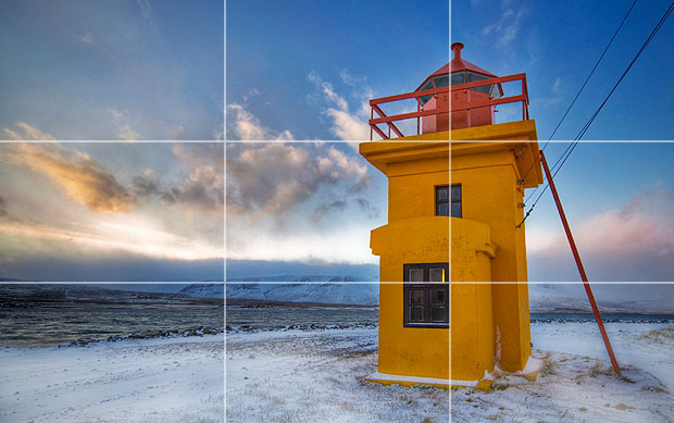
Rule of Thirds
The Rule of Thirds is a theory dictating how an image should be composed in order to create an aesthetically pleasing result. It’s more of a guideline than an actual rule. The principle involves splitting an image into nine equal parts and creating a balance.
Negative Space
“Negative Space” or “White Space” is the empty space between and around elements of a design or page layout. It follows the philosophy that less is more. Having empty space is not a bad thing. It helps draw attention to and accentuates the content on the design.
Readability / Legibility
Legibility
Consider what font you choose and what size the font will be in. Will it be body copy or a headline? It is a visual statement or simply a vehicle for the audience to read the information? Will you be using more than one font in the design? Does the font make sense for the tone / style of your design?
Readability
Readability is about arranging words and groups of words in a way that allows the readers eye to access the content easily and in a way that makes sense. Think about spacing, line height, size, hierarchy, contrast…..
Repetition
Definition:Repeating visual elements such as line, color, shape, texture, value or image tends to unify the total effect of a work of art as well as create rhythm. Repetition can take the form of an exact duplication (pattern), a near duplication, or duplication with variety.
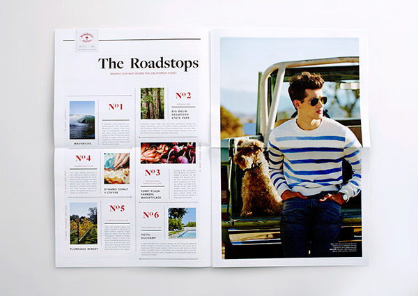
Notice the repetition of the style of elements that creates the list of roadstops.
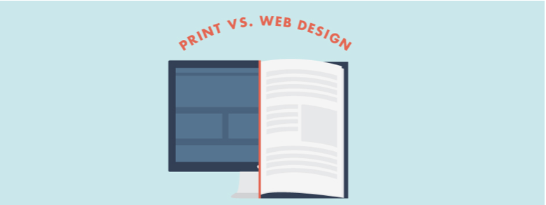
Consider Your Medium
It’s always key to think about what you medium you’re designing for – whether it’s print or web or mobile. This will guide color mode, how you layout your design, readability/legibility, etc.
Knowing your Audience
Before starting any design, it’s important to know who you are designing for and understand how to best appeal to them. Doing some user research can go a long way in helping guide how you design something – it will guide tone, format, look and feel, and more. For example, designing an infographic about nutrition for parents versus for children should yield different results. For instance, for children, you might want to keep a playful tone and be more image heavy than text heavy. On the other hand, you may want to have solid textual information and stats and a more sophisticated or elegant design for parents. After all, form follows function. If you know who you’re catering to and the reasoning behind it, then the form and design will follow. So do your research and spend time thinking about how that will translate into your design.