Typography Basics
In this tutorial, we’ll dive into the basics of typography and how to choose fonts for the right situation. First, we’ll cover terms you should know and then give you 5 simple rules to follow!
Typography Terms
Before we go into the basics, here are some terms to go over.
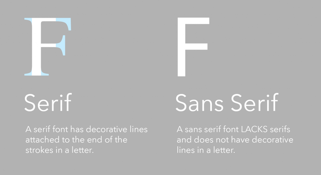
Serif vs. San Serif
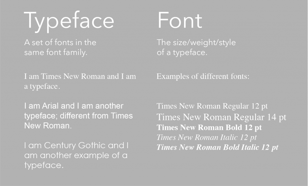
Typeface vs. Font
Think of a font as a SUBSET of a typeface.
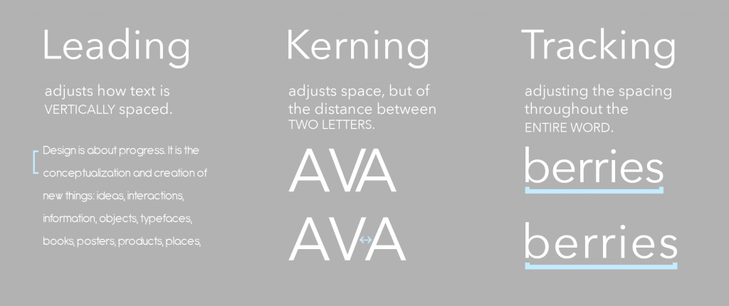
Leading, Kerning, and Tracking
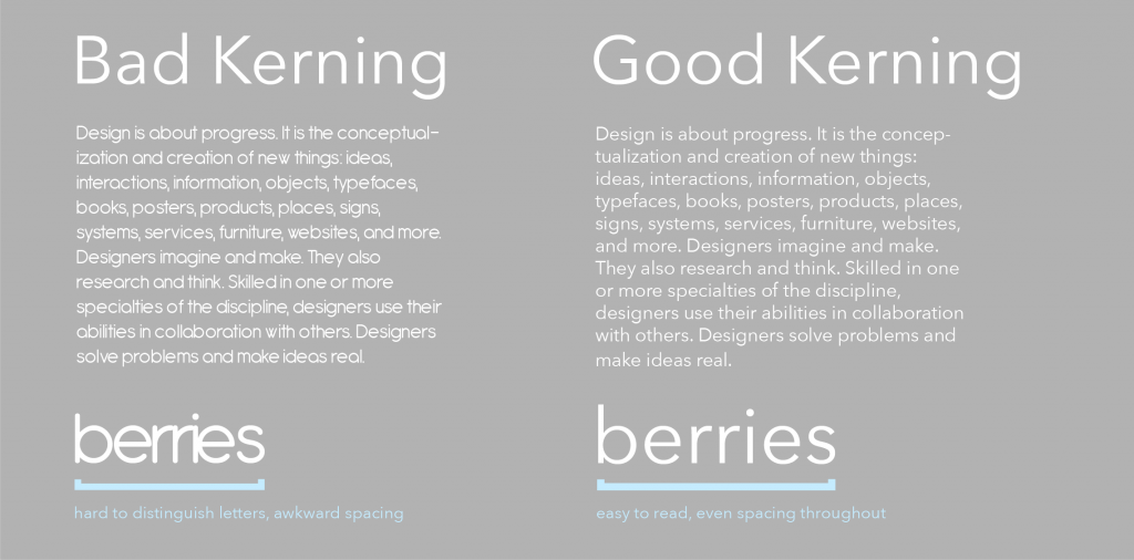
Kerning and tracking might seem similar, but kerning refers to the space between two letters, whereas tracking refers to the spacing throughout the entire word:
Good vs. Bad Kerning
Watch out for free fonts that have problematic kerning and awkward spacing between letters/words. With bad kerning, letters can be too close together, forming non-distinguishable characters, and it will be harder to read in general:
Five Basic Rules to Follow
Now that we have the basic vocabulary down, we can go into 5 rules that will solidify your typography.
Rule No. 1: Make Sure Your Text is Readable
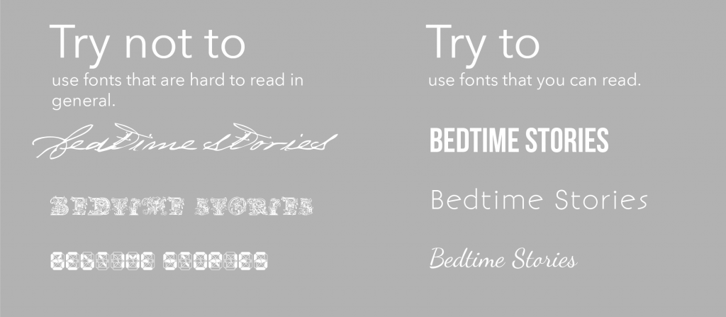
This seems like an obvious one, but make sure your readers can EASILY read what you’re trying to say.
There are some fonts that are simply hard to read, like certain script/fancy fonts, so unless you have a good reason to use them, use them sparingly (we don’t want to make our readers work harder than they have to!).
Also keep in mind that the smaller the print, the simpler the font should be:
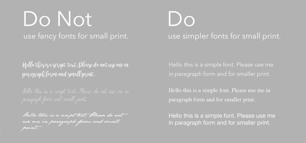
*Note: It is easier to read serif fonts in longer paragraphs because the lines help the eye travel faster to the next word!
Rule No. 2: Value White Space
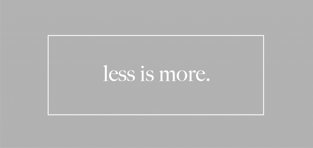
Use white space to your advantage, and don’t be afraid of empty space. Remember: less is more.
If you have more space, use appropriate levels of kerning and tracking to give the words breathing room, better legibility, and to ultimately make it easier on the eye.
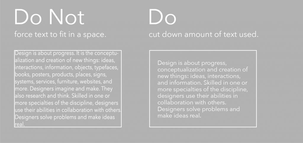
If you don’t have enough space, DO NOT squish the text to make it fit. Make room by editing and refining your main idea, and cut out the extra.
Rule No. 3: Do Not Use Too Many Fonts at Once
Too many fonts can cause for a busy composition and can distract the reader. Remember, less is more. The general rule is to stick to 2-3 fonts in your composition.
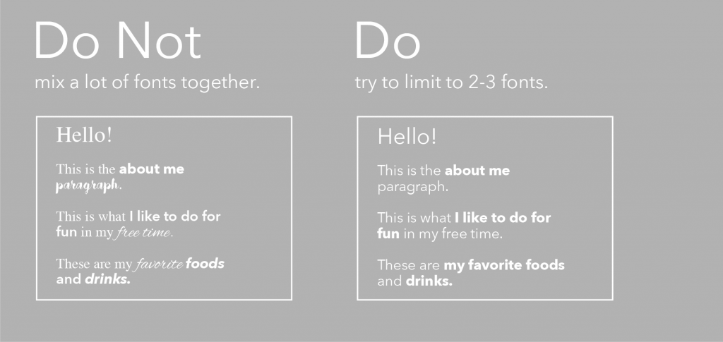
TIP: If you stay within one typeface, your design will be more consistent.
Rule No. 4: Font Style – Fonts will be interpreted differently!
Fonts have personality! This is the fun part, where you can choose between thousands of fonts, and play around with meaning and what you want the font to convey to the reader. Here are a few examples of font personalities:
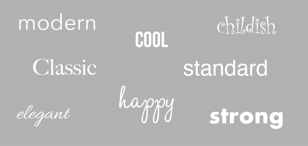
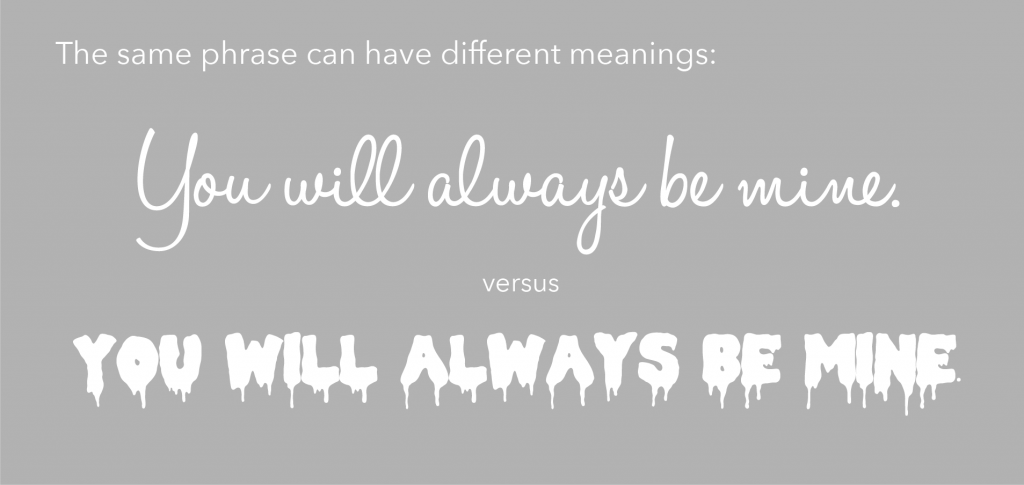
Because of the different font personalities, the same phrase can have different meanings depending on the fonts used to write them, so choose your fonts wisely!
Rule No. 5: Experiment, Revise, Repeat
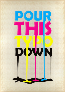
This is the last “rule” of Typography Basics, and I put the rule in quotations because typography is also about experimenting, being creative, and having fun. Here are two examples by Ji Lee (Exit) and pixel-junglist (Pour This Typo Down) on how you can get creative with typography:

Now you know the basics of typography! This will help you in so many different ways, especially with graphic design!
Do you want to learn more about Graphic Design? Check out our Adobe Illustrator tutorials!


