


Topics
Hi! This tutorial will go over how to create gradients with CSS. You’ll be able to do this with beginner skills in HTML and CSS and apply it to any element where you might use background or background-color. Gradients can give your web design a sophisticated look and creating them in CSS rather than using an image reduces download time and bandwidth usage of your website.
Browser support
A quick note before we start: CSS gradients is a feature that was introduced somewhat recently, which means that older versions of browsers (my grandma’s clunky laptop that hasn’t been updated since 1997) might not recognize and support the code. Additionally, the different browsers sometimes interpret code slightly differently (think of it as having to speak different dialects to each one).
In order to make sure our code works in every situation, we write multiple lines of code that do the same thing but may be written slightly differently, as well as a failsafe that sets your color to a solid color for browsers that don’t recognize CSS gradients.
Let’s get started!
Linear gradients
A linear gradient smoothly transitions one color to another in a straight line. The code is written this way:
 background: color1; /* For browsers that do not support gradients */
 background: -webkit-linear-gradient(color1, color2); /* For Safari 5.1 to 6.0 */
 background: -o-linear-gradient(color1, color2); /* For Opera 11.1 to 12.0 */
 background: -moz-linear-gradient(color1, color2); /* For Firefox 3.6 to 15 */
 background: linear-gradient(color1, color2); /* Standard syntax */
Substitute color1 and color2 for your colors of choice, either a recognized color name or hexadecimal code, and separate your two colors with a comma. The comments, marked by /*comment text*/ aren’t part of the code, but tell you what that line of code does. When you’re writing this, make sure that color 1 and color 2 are the same for all lines of code.
This will create a vertical gradient starting with color 1 at the top and color 2 at the bottom. It looks something like this:

Getting Fancy With It
What I’ve shown above, declaring two colors in your code, is the minimum amount of information you need to give to make a CSS gradient. Here’s a few ways you can customize it:
Gradient directions

The default orientation of a gradient is top to bottom. Declaring a direction before your colors tells your browser which way your gradient transitions in. There are a few different ways you can do this. From left to right, the three gradients above were created with the following code:
.left-gradient {
 background: #F2C14E; /* For browsers that do not support gradients */
 background: -webkit-linear-gradient(left, #F2C14E, #F78154); /* For Safari 5.1 to 6.0 */
 background: -o-linear-gradient(left, #F2C14E, #F78154); /* For Opera 11.1 to 12.0 */
 background: -moz-linear-gradient(left, #F2C14E, #F78154); /* For Firefox 3.6 to 15 */
 background: linear-gradient(left, #F2C14E, #F78154); /* Standard syntax */
}

.diagonal-gradient {
 background: #F2C14E; /* For browsers that do not support gradients */
 background: -webkit-linear-gradient(left top, #F2C14E, #F78154); /* For Safari 5.1 to 6.0 */
 background: -o-linear-gradient(bottom right, #F2C14E, #F78154); /* For Opera 11.1 to 12.0 */
 background: -moz-linear-gradient(bottom right, #F2C14E, #F78154); /* For Firefox 3.6 to 15 */
 background: linear-gradient(to bottom right, #F2C14E, #F78154); /* Standard syntax */
}

.sixtydeg-gradient {
 background: #F2C14E; /* For browsers that do not support gradients */
 background: -webkit-linear-gradient(60deg, #F2C14E, #F78154); /* For Safari 5.1 to 6.0 */
 background: -o-linear-gradient(60deg, #F2C14E, #F78154); /* For Opera 11.1 to 12.0 */
 background: -moz-linear-gradient(60deg, #F2C14E, #F78154); /* For Firefox 3.6 to 15 */
 background: linear-gradient(60deg, #F2C14E, #F78154); /* Standard syntax */
}
Horizontal gradients are made by telling your gradients to start at the left or right before your colors, separated by a comma. You can also specify top or bottom in the same way.
Diagonal gradients can be made by specifying which corner your gradient starts or ends in, such as top left or bottom right – two sides separated by a space. Note that this is one where browsers need slightly different instructions:
- for Safari (-webkit-linear-gradient), specify the corner where color 1 begins, ex: top left
- for Opera and Firefox, (-o-linear-gradient and -moz-linear-gradient), specify the corner where color 2 ends, ex: bottom right
- for all other browsers (what we’ve been calling ‘Standard Syntax’ in the comments, linear-gradient), specify the corner where color 2 ends, with the word ‘to’ before, ex: to bottom right
Specific angles can also be specified by saying the angle number followed by ‘deg’ (no space) meaning degrees, for example: 60deg. Zero degrees gives you a vertical gradient that starts from the bottom (think 12 o’clock on a clock) and the degrees rotate it clockwise until 360 degrees.
Multiple Color Stops

To have a multi-color gradient, simply list more than two colors in the order you want them, separated by commas. This is the CSS for the gradient above:
.rainbow {
 background: #C94A4A; /* For browsers that do not support gradients */
 background: -webkit-linear-gradient(left, #C94A4A, #F78154, #F2C14E, #5FAD56, #4D9078); /* For Safari 5.1 to 6.0 */
 background: -o-linear-gradient(left, #C94A4A, #F78154, #F2C14E, #5FAD56, #4D9078); /* For Opera 11.1 to 12.0 */
 background: -moz-linear-gradient(left, #C94A4A, #F78154, #F2C14E, #5FAD56, #4D9078); /* For Firefox 3.6 to 15 */
 background: linear-gradient(left, #C94A4A, #F78154, #F2C14E, #5FAD56, #4D9078); /* Standard syntax */
}
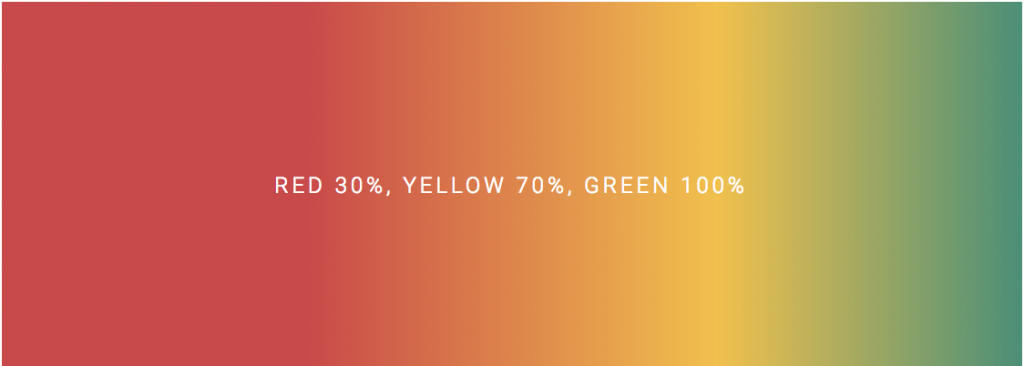
You can also specify where you want your colors to transition, by adding a percentage or pixel number after your color, separated by a space. For example, here I’ve created a gradient where red begins to transition to yellow at 30% of the width, which then transitions to green at 70% of the width:
.specific-gradient {
 background: #C94A4A; /* For browsers that do not support gradients */
 background: -webkit-linear-gradient(left, #C94A4A 30%, #F2C14E 70%, #4D9078); /* For Safari 5.1 to 6.0 */
 background: -o-linear-gradient(left, #C94A4A 30%, #F2C14E 70%, #4D9078); /* For Opera 11.1 to 12.0 */
 background: -moz-linear-gradient(left, #C94A4A 30%, #F2C14E 70%, #4D9078); /* For Firefox 3.6 to 15 */
 background: linear-gradient(left, #C94A4A 30%, #F2C14E 70%, #4D9078); /* Standard syntax */
}
Since I didn’t say at which point the last color should end, it defaulted to 100%, or the very end of the gradient. As I mentioned earlier, you can also specify transition points using pixels (ex: #c94A4a 100px) instead of percentages –just don’t use both pixels and percentages in the same line of code.
Radial gradients
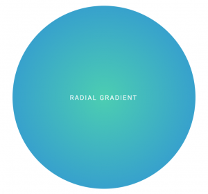
The other kind of gradient you can make with CSS is a radial gradient, or one that starts from the center and transitions into another color outward:
.radial-gradient {
 background: #4CCEB2; /* For browsers that do not support gradients */
 background: -webkit-radial-gradient(#4CCEB2, #2F8FD8); /* Safari 5.1 to 6.0 */
 background: -o-radial-gradient(#4CCEB2, #2F8FD8); /* For Opera 11.6 to 12.0 */
 background: -moz-radial-gradient(#4CCEB2, #2F8FD8); /* For Firefox 3.6 to 15 */
 background: radial-gradient(#4CCEB2, #2F8FD8; /* Standard syntax */
}
The only difference between a radial gradient and linear gradient is that a radial gradient is specified by radial-gradient instead of linear-gradient (makes sense, doesn’t it?). The first color starts at the center, the moves outward. You can still use multiple colors and specify where the transitions occur the same way you do with a linear gradient. Setting a gradient direction is a moot point since it moves out in every direction.
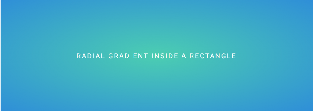
If you put a radial gradient inside a shape that isn’t a circle, the gradient will adjust so that the outside color ends on all edges of the shape:
And that’s my introduction to creating gradients with CSS! There are a few other ways to customize them that I haven’t covered, which you can check out at w3schools. Even though the code looks like a lot, all you really need to do is copy, paste, and plug in your own colors and the few simple commands we’ve covered in this tutorial. Have fun with it!